CSS Style Guide
Intro
This document covers Grove’s approach to authoring CSS, the purpose of which is to reduce…
- Friction when writing new CSS
- Side effects from updating existing CSS
- Proliferation of dead code
…and to promote consistency in Grove’s visual style through code reuse. It has been heavily inspired by Enduring CSS.
Performance is explicitly not a purpose. Why?
On Specificity
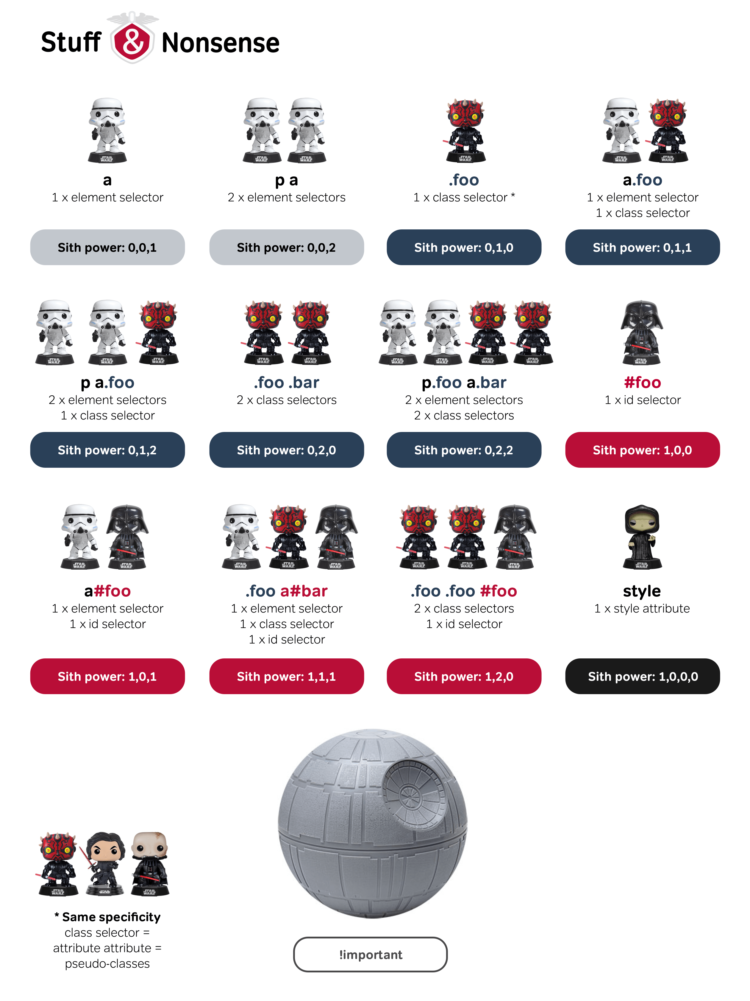
Most of the rules and guidelines contained herein put constraints on specificity, without which friction increases and reuse decreases. By establishing a baseline specificity for all new CSS, we can easily predict which rules will affect our element, and what would be required to override them.
If you need a refresher on specificity, check out CSS Specificity Wars, or use this handy calculator.
Styling Your Component
First, look to reuse.
Ask around to see if any similar patterns have already been implemented. Our goal is to move towards reusable components, so don’t be afraid of some light refactoring to that end, but test your changes thoroughly!
Get up and running quickly with utility classes…
Need to style something new? Utility classes (e.g. text-right, mr-sm-2) are a great way to prototype the design quickly. Foundation has a lot, and we have some of our own as well.
…then get rid of them.
Utility classes pose problems for long-term maintainability, as there usually ends up being no single source of truth. Once you’ve determined the right mix of styles, give your element a descriptive class and copy what you need from the utilities.
Finally, DRY it up if necessary.
If you see more than a little repetition, look for opportunities for reuse or abstraction, such as variables, Sass mixins or placeholder selectors. But remember that it is not repetitive to have two unrelated elements that both happen to have text-align: center, and trying to abstract individual properties does not solve a real-world problem. Look for common design patterns and make those the basis for your abstraction.
Class Names
A good class name does two things: it describes what something is (not what it looks like), and it indicates the blast radius of changes to the class’ styles. If your class name does this, don’t get too caught up in this next part.
[.namespace-]Node[_ChildNode][-variant]
Let’s break that down:
- namespace - The scope you’re working within, such as a page or set of pages. It indicates the intended boundaries for reuse of your class. Keep it succinct. Optional for reusable components.
- Node - The element that you’re styling.
- ChildNode - When styling a descendant of
Node, such as list items in an unordered list. Optional. - variant - When you’ve made this class before, but something is slightly different. Optional.
Example
<div class="paper-Hero">
  <h1 class="paper-Hero_Title">
    Strong, tree-free paper that replants the forest
  </h1>
  <p class="paper-Hero_Copy">
    ...
  </p>
</div>
<div class="AddToCart AddToCart-sticky">
  <button
    type="button"
    class="AddToCart_Button"
  >
    Add to Cart
  </button>
</div>
Selectors
Most of the time, just use a single class
When every rule selector is a single class, the cascade is predictable. You can rely on source order and override easily, and your rules are innoculated against markup changes.
BAD
.product-tile .title {}
h3 {}
div.title {}
#product-title {}
GOOD
.ProductTile_Title {}
.ProductTile_Description {}
Use ARIA attributes to represent state
Representing state with an ARIA attribute (when a suitable one exists) improves both consistency and accessibility.
BAD
.presale-ProductDetails.expanded {}
GOOD
.presale-ProductDetails[aria-expanded="true"] {}
Use nesting to override, but only when necessary
With a safe baseline established, you can then use nesting when you need a common component to change based on context.
BAD
.ProductTile {
  .ProductTile_Title {
    font-weight: 400;
  }
}
GOOD
.ProductTile_Title {
  font-weight: 400;
}

.honu-ProductTile {
  .ProductTile_Title {
    font-weight: 700;
  }
}
Use scoped CSS at your own risk
Why do we need these conventions when we can just use scoped? First, it’s important to understand that scoped CSS does not isolate your component. It will prevent your component’s styles from leaking out, but it will not stop outside styles from leaking in. Unique class names will.
Second, scoped CSS makes overrides more difficult. Consider a child component that you need to tweak slightly from the context of its parent. This would normally call for a simple nested selector, but with scoped you will also need to use deep selectors for your styles to take effect.
Scoped CSS also has consequences for imports. If you import a stylesheet containing its own rules into your scoped component, those rules will end up duplicated in the output.
Styles
Variables, variables, variables
Whenever a value is being reused, it should be a variable. This especially applies to margins, fonts and font sizes, and colors. Using variables helps to enforce visual consistency by prompting comparison to existing values.
BAD
.ProductTile {
  font-family: "ValueSans Medium";
  padding: 15px;
}
GOOD
.ProductTile {
  font-family: $font-family-system-medium;
  padding: $base-size * 2;
}
Nest media queries under each element
Nest media queries under the element they apply to so that all styles affecting that element can be found in one place.
BAD
.ProductTile {}
.ProductTile_Title {}

@media #{$medium-up} {
  .ProductTile {}
  .ProductTile_Title {}
}
GOOD
.ProductTile {
  @media #{$medium-up} {}
}

.ProductTile_Title {
  @media #{$medium-up} {}
}
Write mobile first
It is typically easier–and often results in less code–to expand a mobile layout to desktop than to shrink a desktop layout to mobile.
BAD
.ProductTile {
  display: flex;
  flex-wrap: no-wrap;

  @media #{$small-only} {
    display: block;
  }
}

.ProductTile_Title {
  text-align: left;

  @media #{$small-only} {
    text-align: center;
  }
}
GOOD
.ProductTile {
  @media #{$medium-up} {
    display: flex;
    flex-wrap: no-wrap;
  }
}

.ProductTile_Title {
  text-align: center;

  @media #{$medium-up} {
    text-align: left;
  }
}
Avoid @extend, except on placeholders
Extending an existing class can have unintended side effects. If you need to abstract a set of properties, use a mixin or extend a placeholder class.
BAD
.ProductTile {
  @extend .drop-shadow;
}
GOOD
.ProductTile {
  @include drop-shadow;
}

.ProductTile {
  @extend %drop-shadow;
}